This post, I’m going back to a normal medium of film but I’m spicing it up a little bit. I realized I have yet to cover animated media on this page, so today I decided why not look at anime, a style of Japanese animation. In the future, I’ll look at other forms of animation to show the diversity of style, but for now, I’ll be focusing on techniques used in a specific anime called My Hero Academia.
I must also add that I will be 100% spoiling this show. I’m reviewing Episode 23 from Season 2, so there’s quite a bit of spoiling to be done in this blog post. You’ve been warned.
For those brave souls who are reading regardless, My Hero Academia follows the story of Izuku Midoriya, a young boy born in a world where almost everyone has some type of power (called ‘quirks’). Midoriya, however was not born with a quirk but was given power (a basic strength power) from the Number One hero. The show follows Midoriya as he is accepted into a hero training school as well as the 19 other members of class 1A.
Now, for this specific episode, two main characters Izuku Midoriya and his classmate Shoto Todoroki (who has a half fire, half ice quirk) are facing off and competing against one another for a school competition where the students can show off their powers to the public, in hopes of gaining recognition and in the best case, an internship with a hero agency.
This episode in particular struck me as interesting as the animators were tasked with depicting both fire and ice, as well as almost electricity-like quirk of Midoriya.
Below I’ll link a video to the fight scene between the two which contains dialogue about Todoroki’s fire quirk which he had supressed. There’s honestly a lot to unpack there but that’s not the point of this post so I’d recommend just ignoring that for now.
For Todoroki, his power is split in half with his right side controlling his ice quirk, and the left controlling his flames.
Flames can be a hard thing to animate because of how ephemeral they are, easily changing direction, intensity, and shape. Some artists like to depict flames in a more solid state, but in the case of My Hero Academia, the creators chose to go with an almost water like flow. His flames billow and dissipate like smoke, while maintaining the orange glow that flames give off. As well as this, the creators also represent the power and intensity of Todoroki’s flames through the gust of wind it expels as he draws the flames from his body. When it comes to animation, artists have much more freedom with the stories and images they can portray, so details such as these are up to interpretation. Each choice the director/artist makes is telling of their particular style. We can see Kohei Horikoshi’s (the creator of My Hero Academia) style represented in not just his depiction of flames but also the ice, Midoriya’s quirk, and the linework of each character (which we will get to later).
On the other side, we see his ice powers represented. For ice, it is a bit more predictable than fire. Ice cracks and spread in a fairly geographical way, however, Horikoshi seems to take a different approach for representing ice through Todoroki. Todoroki is shown creating crystals of ice that grow rapidly or slowly depending on his attack, and ultimately creates large blocks of ice that he directs at Midoriya. Instead of depicting the ice as massive shards, Horikoshi chose to utilize two shapes, crystals and blocks only, interchanging the use of them to portray a variety in the shapes Todoroki can produce. However, we also see the ground ice over as Todoroki spreads it from his foot. While it may seem natural to have crystal or snowflake type patterns emerge on the ground due to how often that depiction is used in animation, Horikoshi opted for a more frozen lake type of appearance as the ground seemed to gain a layer of ice, somewhat resembling marble due to its random mix of textures and colors.
By depicting both of these powers in this way, Horikoshi presents his style for animating and adds to the overall uniqueness of each of the characters he has carefully crafted for the show.
For Midoriya’s quirk, it isn’t something that would generally be seen by others. A basic strength quirk is often represented by the damage a character can do rather than showing the power itself manifesting within said character. However, this is another aspect of Horikoshi’s choices that make his characters unique. By giving Midoriya’s quirk a visual representation, viewers can understand that he has a truly powerful quirk that he must control in order to maintain its flow within his entire body. This decision adds to Midoriya’s character as he must work hard in order to control and utilize his gained power.
Lastly, Horikoshi’s style is heavily represented through his line work. When the characters are calm, the linework of the scene is generally light and minimal, however when characters are fighting or are tense, the linework becomes heavily, with multiple added lines to give a more detailed visual. This is a subtle style choice but it adds to the action of the show by creating a clear separation between tense and calm moments for the characters.
Overall, animation is not an easy art form. Whether it is digital or traditional animation, both have obstacles that animators must face and overcome. For My Hero Academia, it follows a manga (a comic book) and it must be redrawn, animated, and colored for production as well as being voiced over instead of relying on text boxes.
For example, I’m sure we have all either seen of recreated the bouncy ball flip book animation. Below is a slideshow of my own recreation of such (I’m not much of an artist so this will have to do).
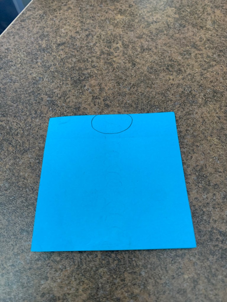
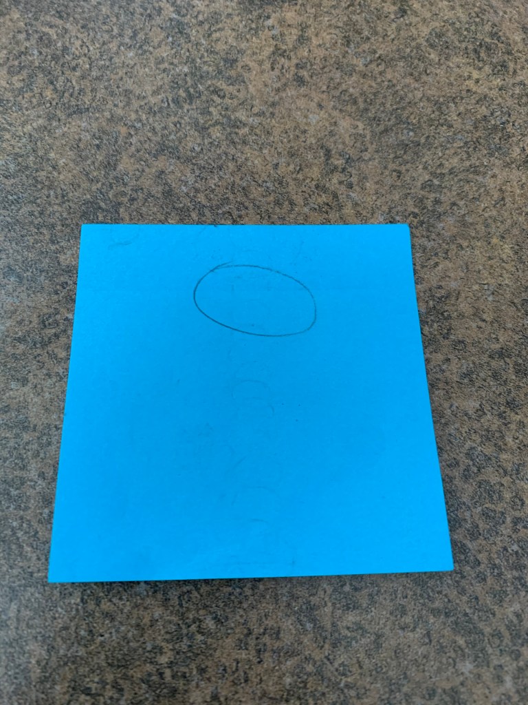
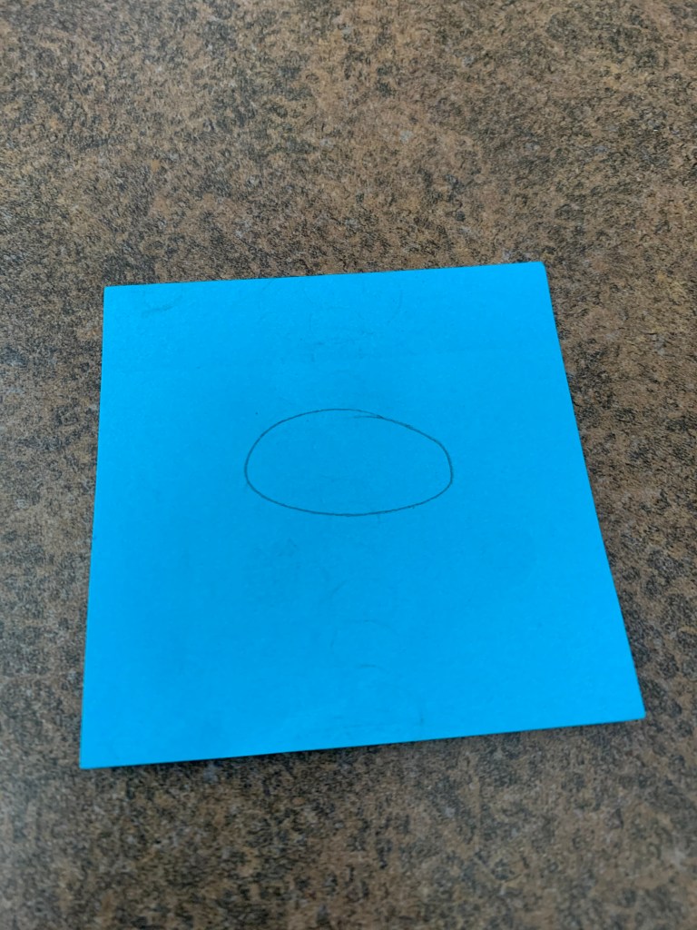
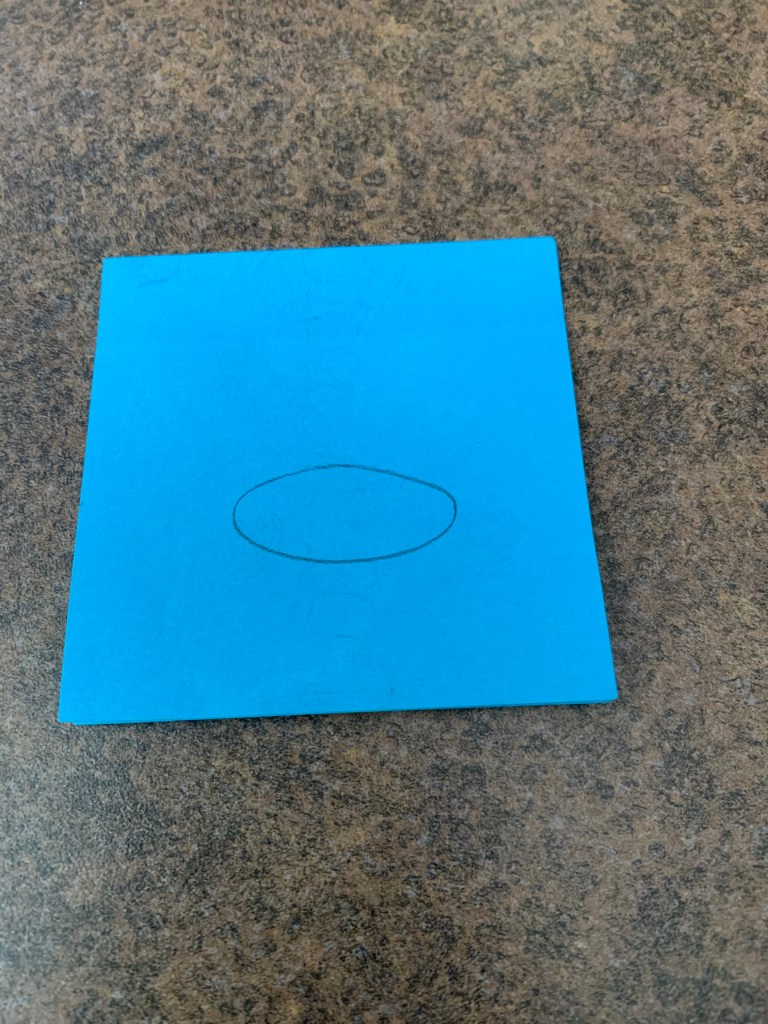
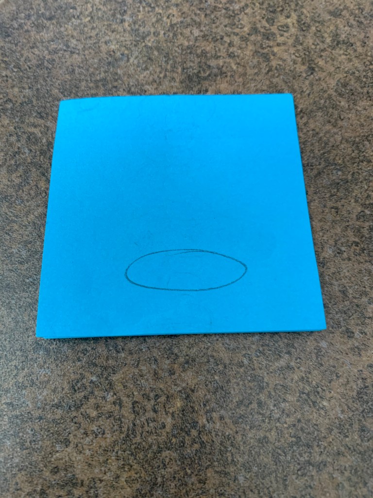

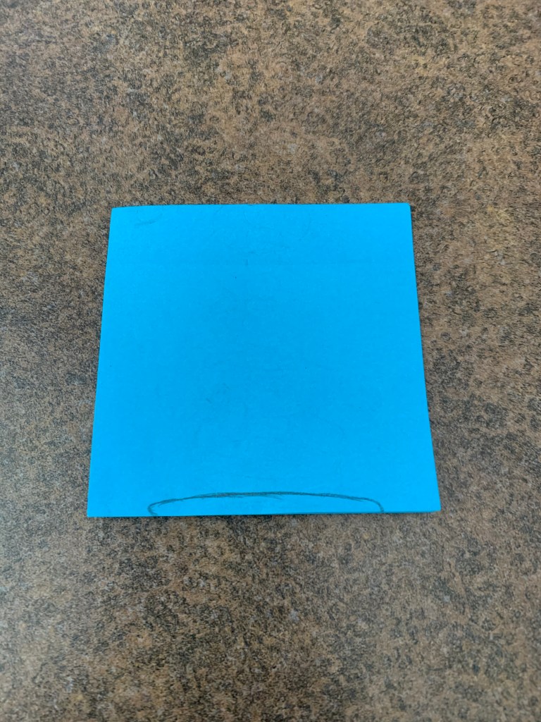
Now obviously, this is the most basic portrayal of how traditional animation works. Artists have to sketch out every individual frame in order to create an animated scene, including much more detail than the very badly drawn ball I drew on some sticky notes.
Animation as a whole is much more complex than it may seem at first glance. Sony Pictures has a pretty good behind the scenes piece detailing the amount of hard work and detail artists put into their work so I’ll link it below if you’d like to learn more.
http://www.sonypicturesmuseum.com/behind-the-scenes/animation
For now though, this is all I have to offer.
Did you like this post? Leave a like! Have an experience with animation of your own or thoughts on Horikoshi’s animating style? Comment down below!
Until next time, you can find me peering through the viewfinder and looking ahead to my next post where I’ll talk more about animation with Isle of Dogs by Wes Anderson.
